Evaluating Petfinder
A usability evaluation of Petfinder using heuristics review and moderated user testing, with design suggestions for improvement.
Role
UX Researcher
UX/UI Designer
Time
1 month
(Oct - Nov 2022)
Category
Usability Evaluation
Web Design
Skills & Tools
Heuristic Evaluation, Usability Testing, Figma, Zoom
Overview
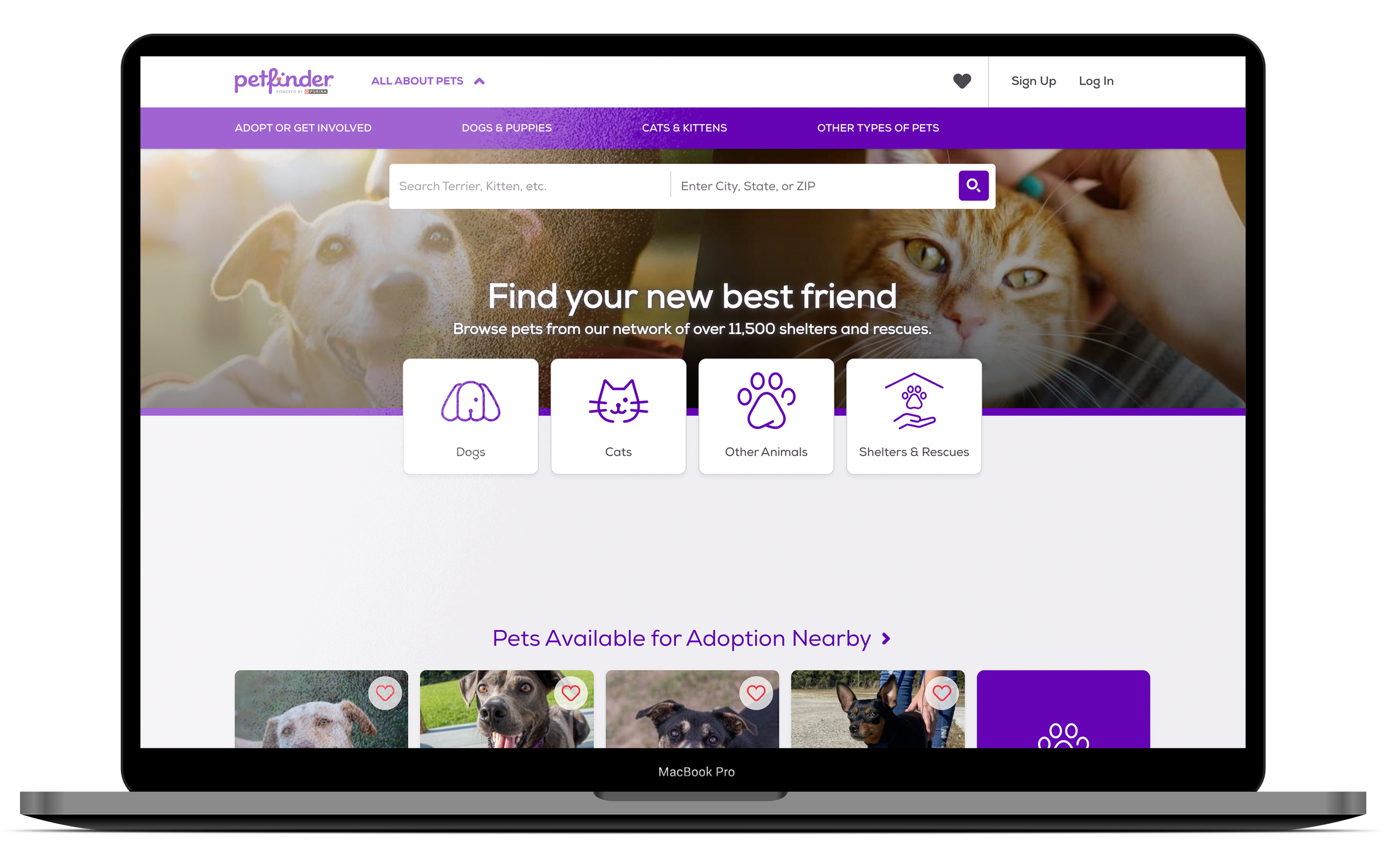
Petfinder is a popular online platform that connects individuals looking to adopt pets with animal shelters and rescue organizations across the United States and other countries. As a trusted platform that works to facilitate the adoption of millions of animals, the usability and user experience of Petfinder are crucial for helping individuals find and adopt pets successfully.
Using a combination of heuristic evaluation and moderated usability testing, I hope to identify any pain points and suggest design changes that may enhance the adoption process, the user satisfaction, and ultimately help more animals find their forever homes.
Heuristic Evaluation
I chose to use Jakob Nielsen’s 10 Usability Heuristics to evaluate Petfinder. These heuristics are a well-established and practical set of principles for evaluating the usability of user interfaces.
Visibility of system status
(+) Always visible filters: The filters section is always visible on the right side of the web interface. The filters that are currently applied are shown at the top of the search page.
(+) Responsive feedback: The search results are immediately updated per every filter change. The system responds in a timely manner (about 2 seconds) and uses a loading animation to keep the users informed. When adding a pet to “Favorite”, the heart icon does a little “dance” and changes to filled, indicating that the action is successful.
(-) Ineffective page titles: When opening a pet’s profile, the page title show “Cat for adoption” followed by the pet’s name. If a user has multiple tabs open, they won’t be able to see the pets’ names which makes it hard to navigate between tabs.
2. Match between system and the real world
(+) Natural language: The system uses terminology that is straightforward and familiar to general users. For example, cats and dogs are used instead of felines and canines.
(+) Intuitive filter system: The filter system aligns with users’ mental models and real-world conventions. It allows users to search for pets based on distance, breed, age, size, gender, compatibility with children and other pets, coat length, and color.
(-) Icon-only buttons: Icon-only buttons without accompanying text may introduce ambiguity or confusion. Novice users, in particular, may not have a strong grasp of the symbolic meaning behind the icons.
(-) No pet status: There is no information on pet status (available, adoption pending, adopted) or record of the last time a pet profile was updated, leading users to the wrong assumption that if a pet profile is visible, it is available for adoption. In fact, a pet’s profile might still be up even when they have an application going on or are already adopted.
3. User freedom and control
(+) Clear exits and seamless navigation: The website provides options for users to go back, cancel actions, or exit processes. When going back, users are taken back to the position where they left off instead of the top of the page, so users can resume their search process seamlessly.
(-) Fixed number of results per page: Users cannot control the number of results shown to them on a page. Also, page control is only available at the bottom of the site. Having page control at both the top and bottom of the search would give users more freedom to navigate.
4. Consistency and standards
The website follow established conventions and maintain uniformity (vertical scrolling, filtering and sorting search results.) It also adheres to consistent navigation patterns, visual design elements (color palette, font, icons) and interaction behaviors.
5. Aesthetic and minimalist design
The interface design is clean and minimalist which does not interfere with the heavy graphics coming from the pet photos. It is free of visual clutters and distracting advertisements that could hinder usability and negatively affect user satisfaction.
6. Recognition rather than recall
(+) Save Search function: Petfinder provides users with the option to save a search and revisit it later. Users don’t have to manually reenter their search criteria each time they visit the site.
(+) Recently viewed pets: At the bottom of the homepage, Petfinder shows returning users a list of their recently visited pet profiles so people don’t have to rely on their memory to find these pets again.
7. Flexibility and efficiency of use
(+) Comprehensive search engine and supporting features: Petfinder's search and filtering options provide flexibility and efficiency for both novice and experienced users. The essential information about each pet is readily accessible on the search results page. Personalization options, such as saving favorite pets, saving searches, and taking a quiz enhance the user experience.
(-) No “Remember me”: The website doesn’t provide users with the option to stay logged in so users have to log in to their account every time they visit. While this approach considers the users’ security and privacy, some users might find it inconvenient and time-consuming.
8. Error prevention
(+) Review information: Perfinder allows users to review their information, their compatibility with the pet, and add personal notes that will be sent to the shelter. This step creates “intentional friction” that prevents both user errors and mass inquiries sent to shelters.
(+) Preview number of results: When applying a filter, the system informs users in advance how many results that match their requirements will be returned. This prevents users from performing searches that return empty.
9. Help users recognize, diagnose, and recover from errors
(+) Clear error message: If users perform a search that returns empty, they receive an error message is clear and helpful. It uses natural language (no “404 error”) and suggests an actionable solution (broadening your search.)
10. Help and documentation
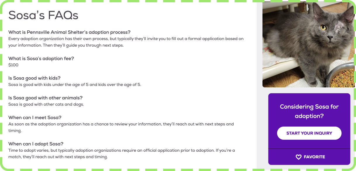
(+) FAQ Sections: Petfinder has a FAQ section in its footer for general use of the website, and also a FAQ section on each pet’s profile page which informs users of the shelter’s specific policies, requirements, and application process.
(+) Resources for Pet Owners: Petfinder offers information and articles related to pet care and responsible pet ownership.
(-) Limited User Support: While there is a "Contact Us" link in the footer, the availability and responsiveness of user support channels are unclear.
Usability Testing
The usability test was conducted remotely and was moderated. All sessions were hosted via Zoom and recorded for analysis. The testing process was non-invasive with no inquiries directed to shelters. No personal health or financial information was collected.
1. Participants
I recruited a total of 6 participants through personal network, including 1 pilot participant (PP-01) and 5 main participants (MP-01 to MP-05). The participants were selected to represent a diverse range of characteristics such as age, gender, education level, job titles, and technical experience. The technical experience of participants varied, with some considering themselves to have moderate expertise in using computers for work. Participants were informed about the usability testing procedure and purpose, and they provided their consent before participating.
Table 1. Participant Demographics
2. Task List
In the pilot study, I held a Zoom session with participant PP-01 while being in the same room as her to observe her interaction. I gave the tasks to PP-01 one at a time using the Zoom chatbox. The participant struggled with the Zoom interface, particularly finding the chat box, reading tasks, and interacting with the website while using Zoom. To address this, I decided to provide participants with a PDF task list containing one task per page. Some features required users to log in, so I provided each participant with a dummy account. Learning from the pilot study and expert feedback, I revised the task list multiple times to ensure clarity and eliminate over-complicated tasks. The final task list is as follows:
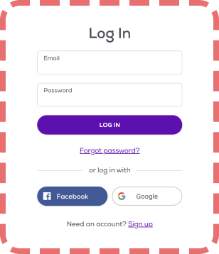
Login with the credentials provided.
How many Akita dogs are available for adoption within 100 miles of College Park, Maryland?
What is the name of the first Akita dog on the list when you sort the results by Newest Addition?
What are the name and phone number of the shelter the said Akita dog comes from?
What is the website of the said shelter?
Add the Akita dog in Task 3 to your Favorite.
Take the Best Match quiz to find your ideal cat. (The only requirement is that you look for a cat. All the other answers are up to you. You need not disclose any accurate personal information to complete this quiz.)
Attempt to send an inquiry to adopt any cat on the quiz result page. (No need to actually send the inquiry.)
Add all the senior Maine Coon cats within 25 miles of the 20024 zip code to your Favorite.
Remove all the animals on your Favorite list.
The list consisted of tasks that were usually performed by typical users. Tasks 1-8 were designed to assess the usability of a variety of Petfinder’s features. Task 9 was a little more complicated but practical, as users were more familiar with the interface now and should be able to combine multiple filtering options (age, breed, location). Task 10 explored whether the Favorite list was easy to locate and use.
3. Results
The time the sessions took varied widely from 14 min up to 1h 02 min (~31 minutes on average.) The successful rate ranged from 80-100% across all tasks. Participants reacted positively to the interface and thought it was easy to use, with some room for improvement.
Table 2. Result Summary
Table 3. Task Time
Table 4. Task Performance
4. Findings
Finding 1
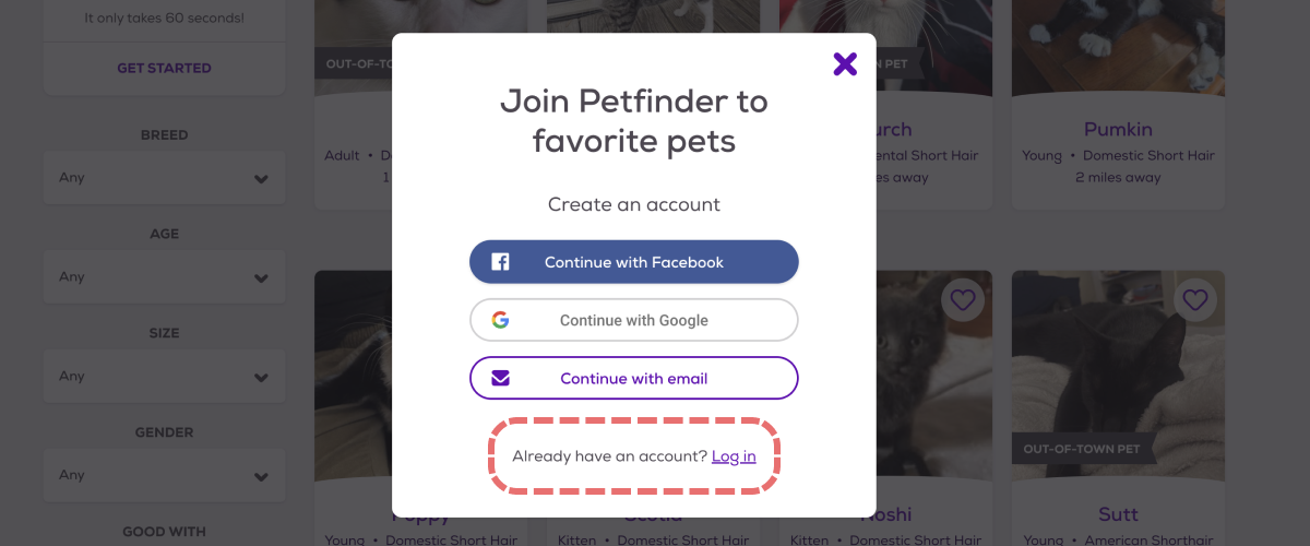
In Task 1 (“Login with the credentials provided”), all participants succeeded. However, MP-01 struggled with a particular pop-up on the platform. This is a pop-up triggered when users attempt to add a pet to the favorite list while not logged in. The sign-up and log-in options were not designed equally: all three big buttons were sign-up options while the log-in option was a hyperlink. MP-01 was drawn to the sign-up buttons and couldn’t find the log-in option. The interface designer might have not realized that text buttons without a boundary (hyperlink form) don’t look “interactive” and are an obstacle for novice users.
Finding 2
MP-02 faced challenges and completed 6 out of 10 tasks successfully. He still gave positive feedback to the interface as he believed his struggles were mainly due to his limited familiarity with computers. However, he pointed out that he couldn’t locate the Favorite List because he didn’t understand that the heart icon meant “Favorite.” This reflected my evaluation in the heuristic review that novice users may not have a strong grasp of the symbolic meaning behind the icons, therefore the use of icon-only buttons should be avoided.
Finding 3
The users struggled to find the sorting feature and to change the location and proximity. They expected all the filtering and sorting options to be in the same place which was the column on the left side, but instead these functions that were related were scattered in different areas of the interface. The location and distance settings were on a horizontal bar; the filters were in a vertical column on the left, and the sorting option was in a box on the right. While the layout seemed balanced and visually pleasing, it took the users longer to locate all the elements and use them harmoniously.
Finding 4
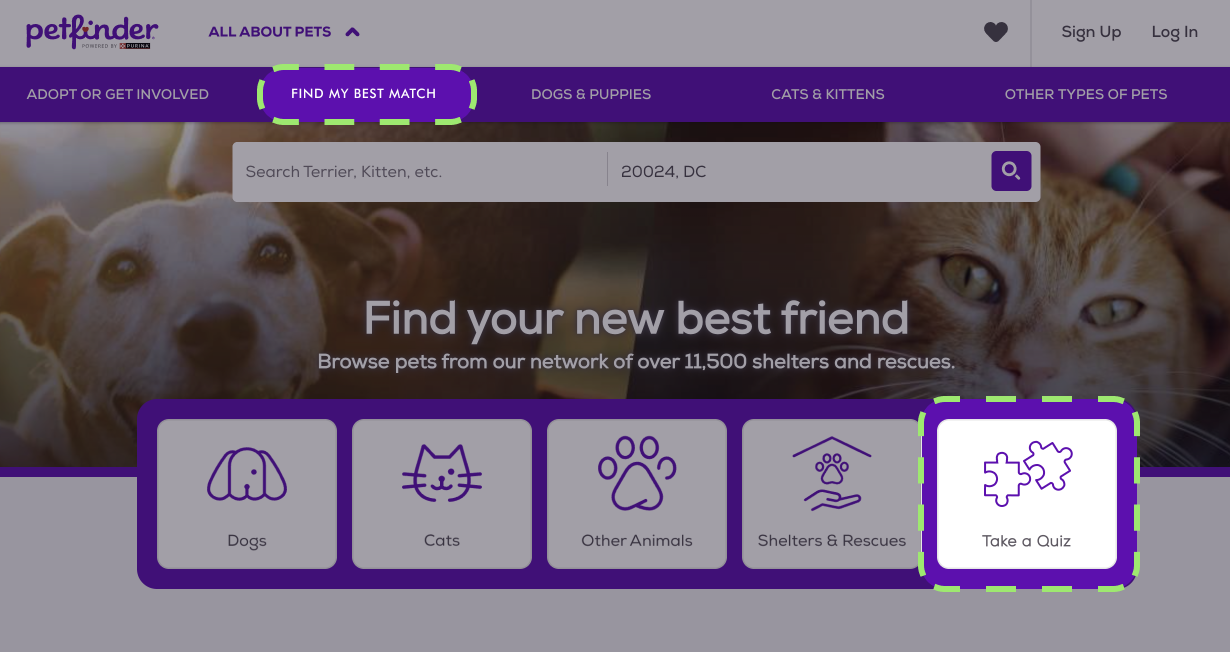
In Task 7, all participants had difficulty locating the Best Match quiz on the website. Most users scanned the header, the horizontal menu, and the front page overall for anything that said “Best Match” or “Quiz” but there wasn’t. They could only find the quiz if they clicked on the search box and found the quiz option in the drop-down menu, or if they were already on a search page. The Best Match quiz is an important feature that improves the user experience but is hidden away. MP-03 gave up the task and later commented that if Petfinder wanted people to take the quiz, it should be easier to find. The participants also wanted the option to retake the quiz.
Design Suggestions for Improvement
Based on the findings in my heuristic review and usability testing of Petfinder, I suggest the following design changes that could further facilitate the pet search and adoption process and improve user satisfaction.
1. Increase visibility of the Best Match quiz
The Best Match quiz is a feature that sets Petfinder apart from its competitors and is crucial for providing users with personalized matches. It deserves more exposure in multiple areas on Petfinder’s homepage, instead of tucked away in the search drop-down and search result page.
2. Reorganize the filtering and sorting features
While Petfinder offers a comprehensive and intuitive search engine with thoughtful filtering and sorting options, they are broken into smaller parts and scattered in several areas of the interface, which takes the users longer to locate all of them and use them effectively. To align with users’ mental models and real-world conventions, I suggest that all the sorting and filtering options are organized in a vertical column on the left side of the interface for maximum visibility and ease of use.
3. Eliminate the use of icon buttons and text buttons
Interfaces should cater to both novice and experienced users. While expert users barely slow down to notice what type of button they’re interacting with, for novice users, buttons that don’t look like buttons may tremendously hinder their experience. Icon buttons may introduce ambiguity or confusion because users may not readily understand the meaning or purpose of the icons. Text buttons (that look like hyperlinks) are less visually prominent and may not always convey their purpose clearly. Designers should always consider graphical buttons or buttons with text and icons to make sure interfaces are effective and user-friendly to a wide variety of users.
Thank you for reading!
This portfolio is best viewed on a desktop. Please visit on a larger screen for the best experience. :-)

